Visualizations using nlp.load().viz()
You can use the build in visualization module on any pipeline or model returned by nlp.load().
Simply call viz() and an applicable visualization will be deducted.
Alternatively, you can also manually specify, which visualization you want to invoke.
These visualizations are provided via Spark-NLP-Display package
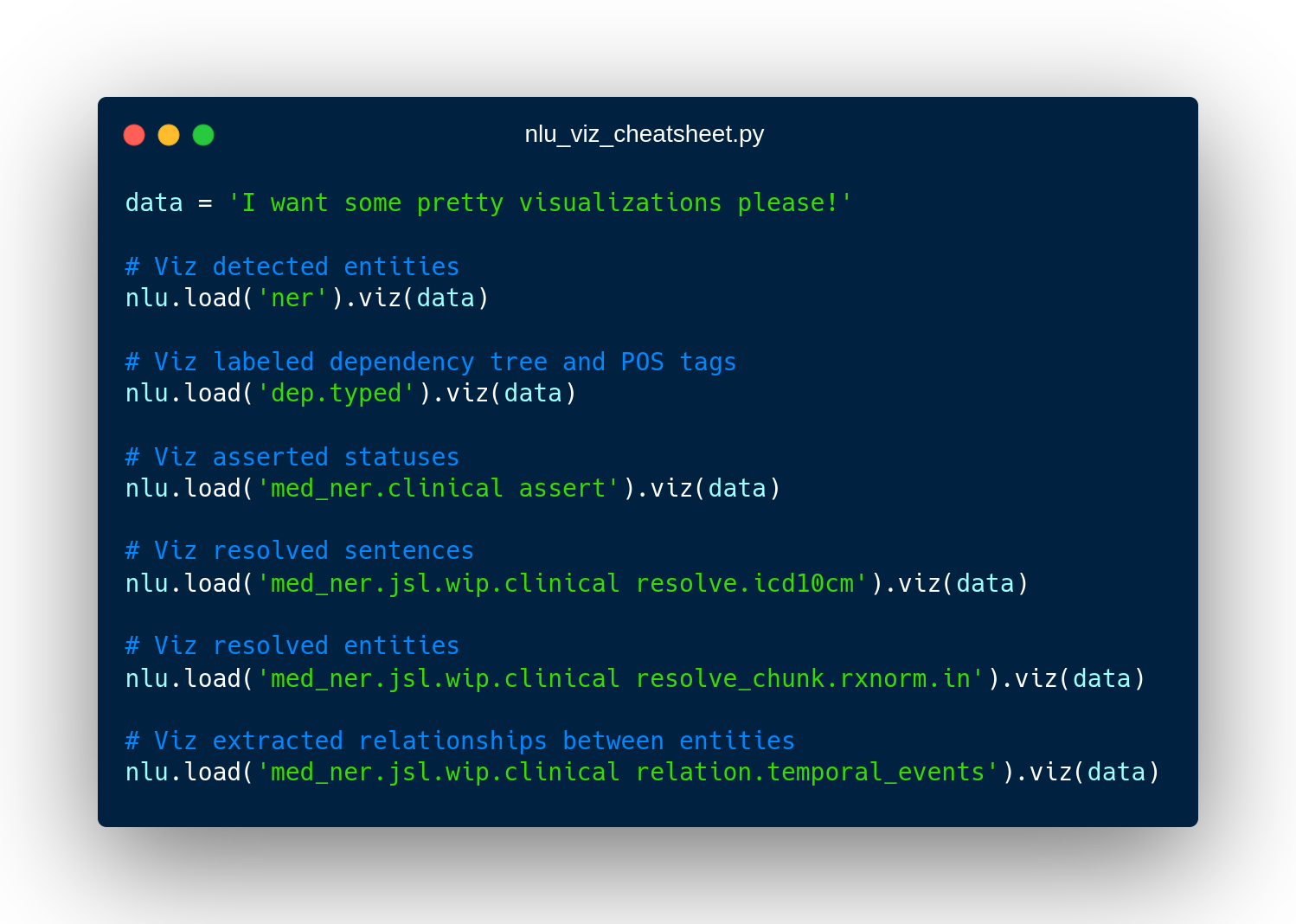
- Named Entity Recognizers
- Medical Named Entity Recognizers
- Dependency parser relationships which labels and part of speech tags
- Entity resolution for sentences and chunks
- Assertion of entity statuses
See the visualization tutorial notebook for more info.
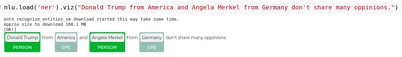
NER visualization
Applicable to any of the 100+ NER models! See here for an overview
nlp.load('ner').viz("Donald Trump from America and Angela Merkel from Germany don't share many oppinions.")
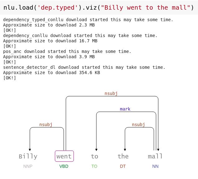
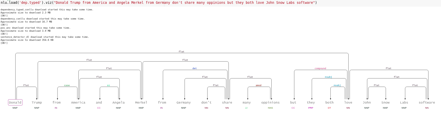
Dependency tree visualization
Visualizes the structure of the labeled dependency tree and part of speech tags
nlp.load('dep.typed').viz("Billy went to the mall")
#Bigger Example
nlp.load('dep.typed').viz("Donald Trump from America and Angela Merkel from Germany don't share many oppinions but they both love John Snow Labs software")
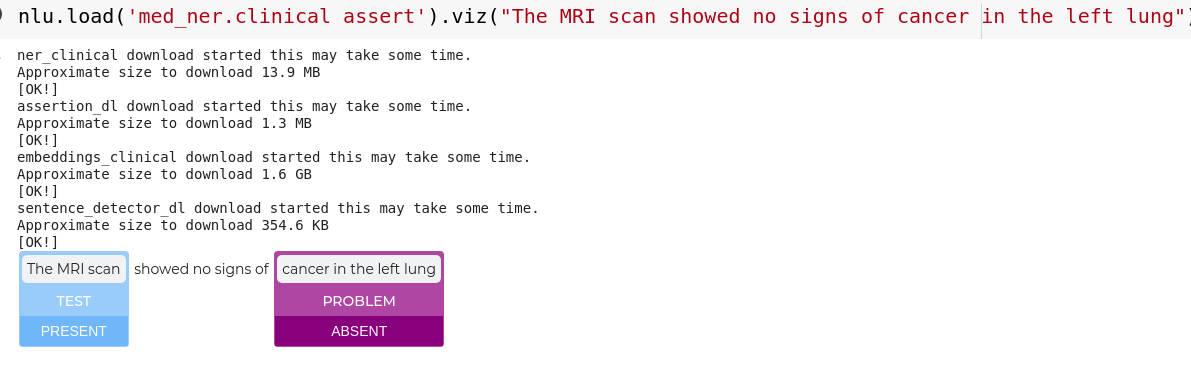
Assertion status visualization
Visualizes asserted statuses and entities.
Applicable to any of the 10 + Assertion models! See here for an overview
nlp.load('med_ner.clinical assert').viz("The MRI scan showed no signs of cancer in the left lung")
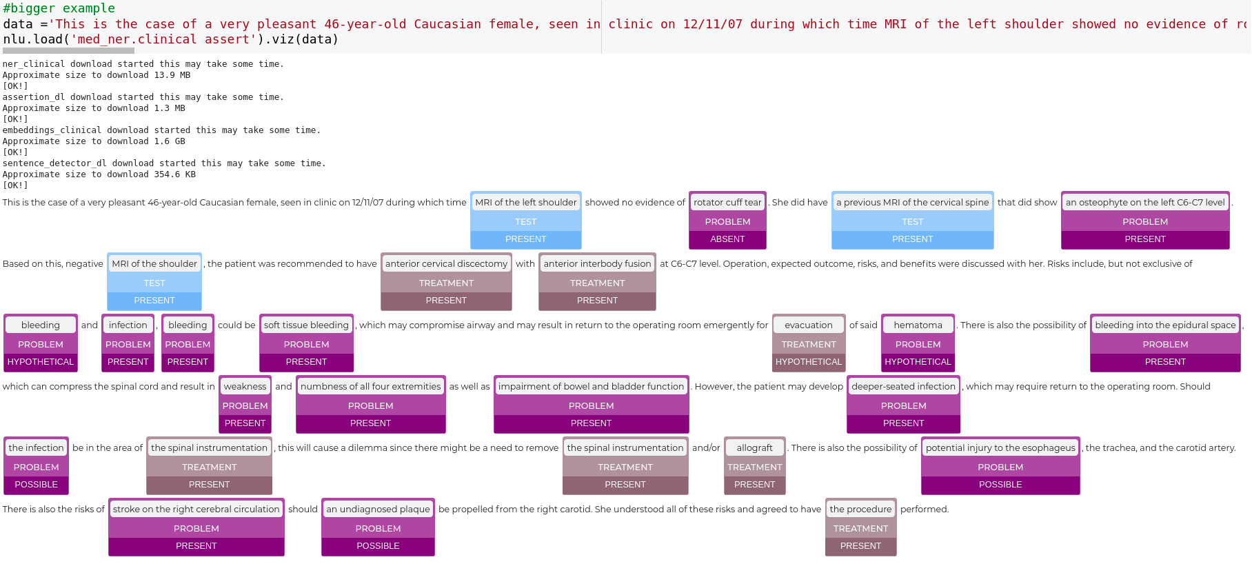
#bigger example
data ='This is the case of a very pleasant 46-year-old Caucasian female, seen in clinic on 12/11/07 during which time MRI of the left shoulder showed no evidence of rotator cuff tear. She did have a previous MRI of the cervical spine that did show an osteophyte on the left C6-C7 level. Based on this, negative MRI of the shoulder, the patient was recommended to have anterior cervical discectomy with anterior interbody fusion at C6-C7 level. Operation, expected outcome, risks, and benefits were discussed with her. Risks include, but not exclusive of bleeding and infection, bleeding could be soft tissue bleeding, which may compromise airway and may result in return to the operating room emergently for evacuation of said hematoma. There is also the possibility of bleeding into the epidural space, which can compress the spinal cord and result in weakness and numbness of all four extremities as well as impairment of bowel and bladder function. However, the patient may develop deeper-seated infection, which may require return to the operating room. Should the infection be in the area of the spinal instrumentation, this will cause a dilemma since there might be a need to remove the spinal instrumentation and/or allograft. There is also the possibility of potential injury to the esophageus, the trachea, and the carotid artery. There is also the risks of stroke on the right cerebral circulation should an undiagnosed plaque be propelled from the right carotid. She understood all of these risks and agreed to have the procedure performed.'
nlp.load('med_ner.clinical assert').viz(data)
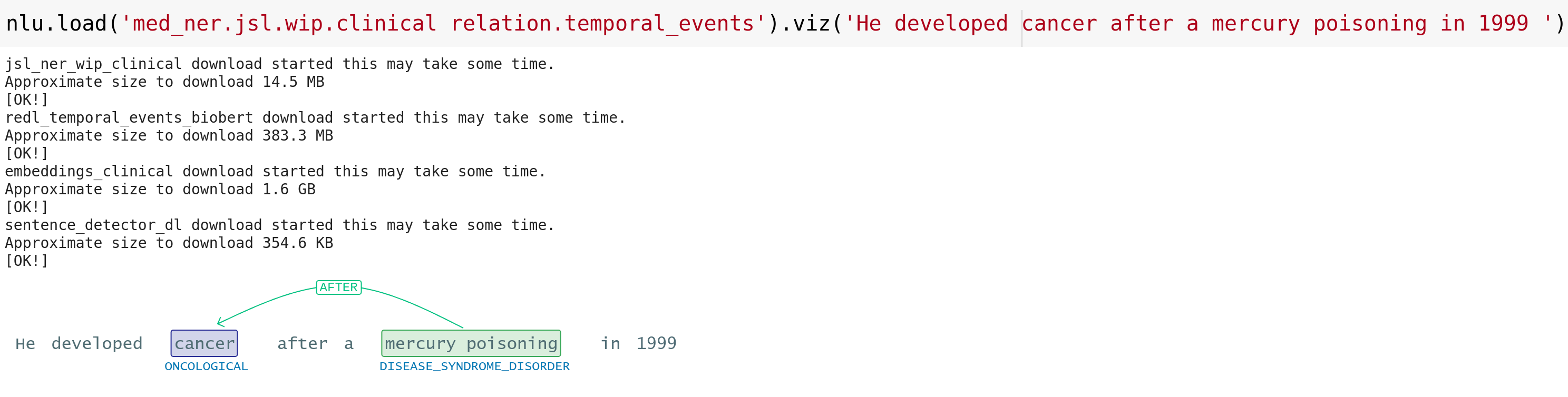
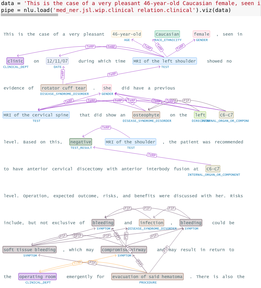
Relationship between entities visualization
Visualizes the extracted entities between relationship.
Applicable to any of the 20 + Relation Extractor models See here for an overview
nlp.load('med_ner.jsl.wip.clinical relation.temporal_events').viz('The patient developed cancer after a mercury poisoning in 1999 ')
# bigger example
data = 'This is the case of a very pleasant 46-year-old Caucasian female, seen in clinic on 12/11/07 during which time MRI of the left shoulder showed no evidence of rotator cuff tear. She did have a previous MRI of the cervical spine that did show an osteophyte on the left C6-C7 level. Based on this, negative MRI of the shoulder, the patient was recommended to have anterior cervical discectomy with anterior interbody fusion at C6-C7 level. Operation, expected outcome, risks, and benefits were discussed with her. Risks include, but not exclusive of bleeding and infection, bleeding could be soft tissue bleeding, which may compromise airway and may result in return to the operating room emergently for evacuation of said hematoma. There is also the possibility of bleeding into the epidural space, which can compress the spinal cord and result in weakness and numbness of all four extremities as well as impairment of bowel and bladder function. However, the patient may develop deeper-seated infection, which may require return to the operating room. Should the infection be in the area of the spinal instrumentation, this will cause a dilemma since there might be a need to remove the spinal instrumentation and/or allograft. There is also the possibility of potential injury to the esophageus, the trachea, and the carotid artery. There is also the risks of stroke on the right cerebral circulation should an undiagnosed plaque be propelled from the right carotid. She understood all of these risks and agreed to have the procedure performed'
pipe = nlp.load('med_ner.jsl.wip.clinical relation.clinical').viz(data)
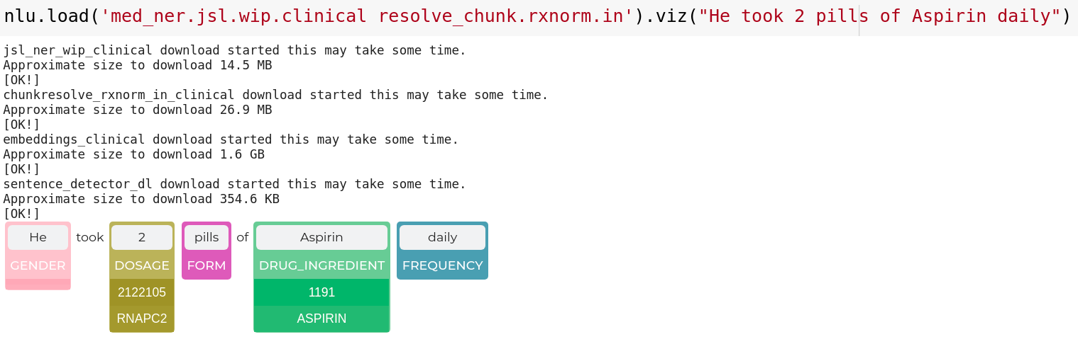
Entity Resolution visualization for chunks
Visualizes resolutions of entities Applicable to any of the 100+ Resolver models See here for an overview
nlp.load('med_ner.jsl.wip.clinical resolve_chunk.rxnorm.in').viz("He took Prevacid 30 mg daily")
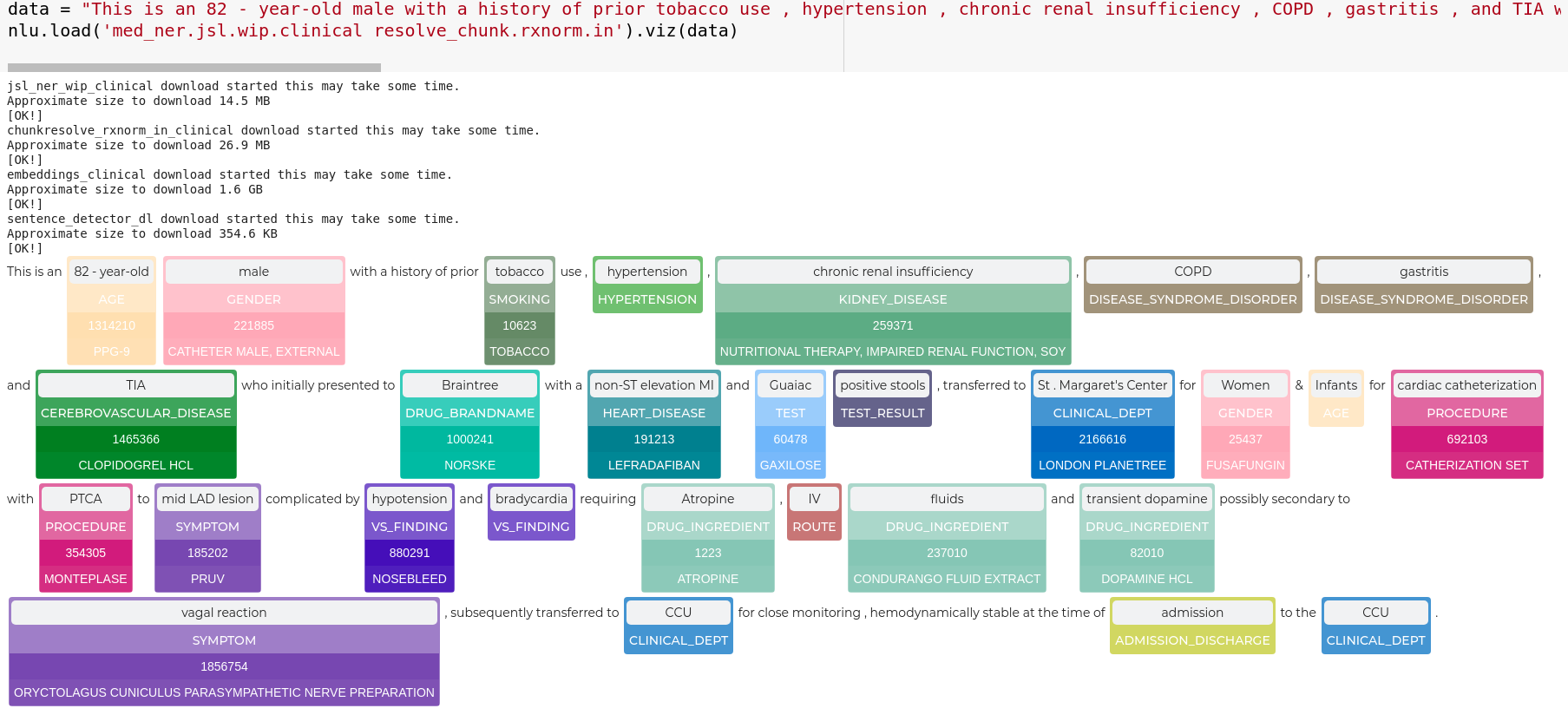
# bigger example
data = "This is an 82 - year-old male with a history of prior tobacco use , hypertension , chronic renal insufficiency , COPD , gastritis , and TIA who initially presented to Braintree with a non-ST elevation MI and Guaiac positive stools , transferred to St . Margaret\'s Center for Women & Infants for cardiac catheterization with PTCA to mid LAD lesion complicated by hypotension and bradycardia requiring Atropine , IV fluids and transient dopamine possibly secondary to vagal reaction , subsequently transferred to CCU for close monitoring , hemodynamically stable at the time of admission to the CCU ."
nlp.load('med_ner.jsl.wip.clinical resolve_chunk.rxnorm.in').viz(data)
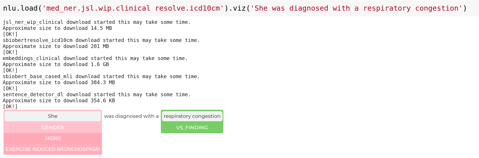
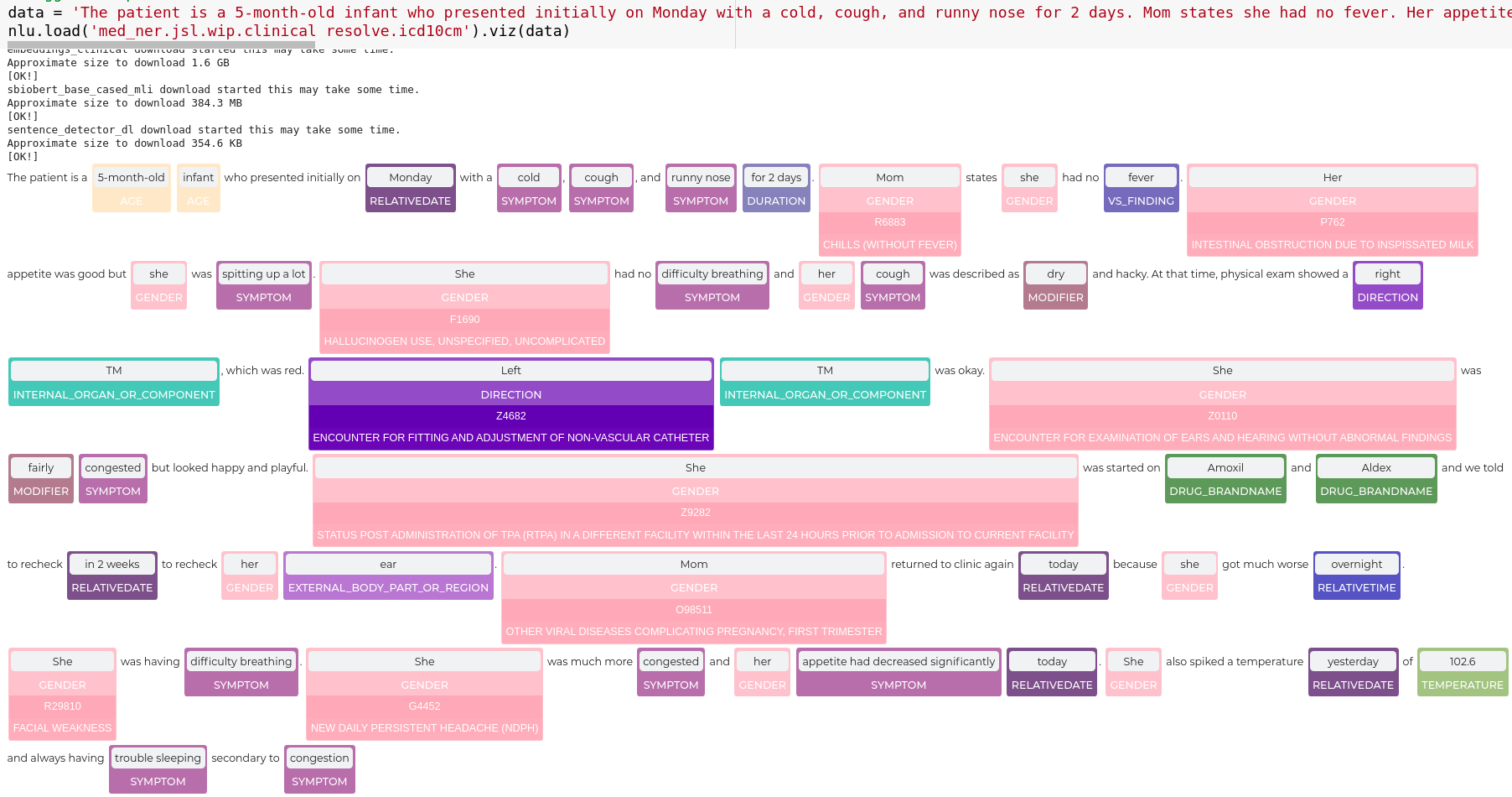
Entity Resolution visualization for sentences
Visualizes resolutions of entities in sentences Applicable to any of the 100+ Resolver models See here for an overview
nlp.load('med_ner.jsl.wip.clinical resolve.icd10cm').viz('She was diagnosed with a respiratory congestion')
# bigger example
data = 'The patient is a 5-month-old infant who presented initially on Monday with a cold, cough, and runny nose for 2 days. Mom states she had no fever. Her appetite was good but she was spitting up a lot. She had no difficulty breathing and her cough was described as dry and hacky. At that time, physical exam showed a right TM, which was red. Left TM was okay. She was fairly congested but looked happy and playful. She was started on Amoxil and Aldex and we told to recheck in 2 weeks to recheck her ear. Mom returned to clinic again today because she got much worse overnight. She was having difficulty breathing. She was much more congested and her appetite had decreased significantly today. She also spiked a temperature yesterday of 102.6 and always having trouble sleeping secondary to congestion'
nlp.load('med_ner.jsl.wip.clinical resolve.icd10cm').viz(data)
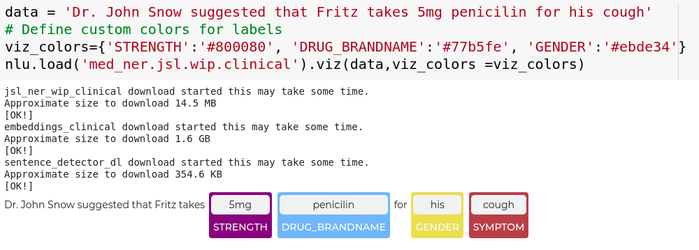
Configure visualizations
Define custom colors for labels
Some entity and relation labels will be highlighted with a pre-defined color, which you can find here.
For labels that have no color defined, a random color will be generated.
You can define colors for labels manually, by specifying via the viz_colors parameter
and defining hex color codes in a dictionary that maps labels to colors .
data = 'Dr. John Snow suggested that Fritz takes 5mg penicilin for his cough'
# Define custom colors for labels
viz_colors={'STRENGTH':'#800080', 'DRUG_BRANDNAME':'#77b5fe', 'GENDER':'#77ffe'}
nlp.load('med_ner.jsl.wip.clinical').viz(data,viz_colors =viz_colors)
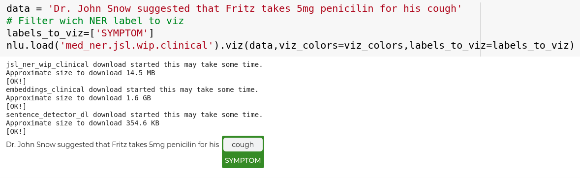
Filter entities that get highlighted
By default every entity class will be visualized.
The labels_to_viz can be used to define a set of labels to highlight.
Applicable for ner, resolution and assert.
data = 'Dr. John Snow suggested that Fritz takes 5mg penicilin for his cough'
# Filter wich NER label to viz
labels_to_viz=['SYMPTOM']
nlp.load('med_ner.jsl.wip.clinical').viz(data,labels_to_viz=labels_to_viz)
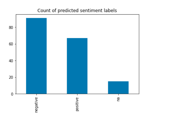
Visualizations using Pandas
Common Idioms
The most common two liner you will use in NLU is loading a classifier like emotion or sentiment and then plotting the occurence of each predicted label .
An few examples for this are the following :
emotion_df = nlp.load('sentiment').predict(df)
emotion_df['sentiment'].value_counts().plot.bar()
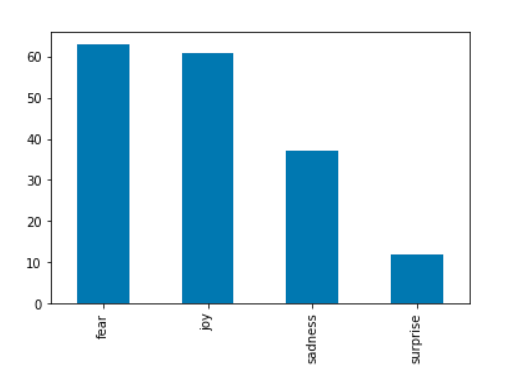
emotion_df = nlp.load('emotion').predict(df)
emotion_df['emotion'].value_counts().plot.bar()
Another simple idiom is to group by an arbitrary feature from the original dataset and then plot the counts four each group.
emotion_df = nlp.load('sentiment').predict(df)
sentiment_df.groupby('source')['sentiment'].value_counts().plot.bar(figsize=(20,8))

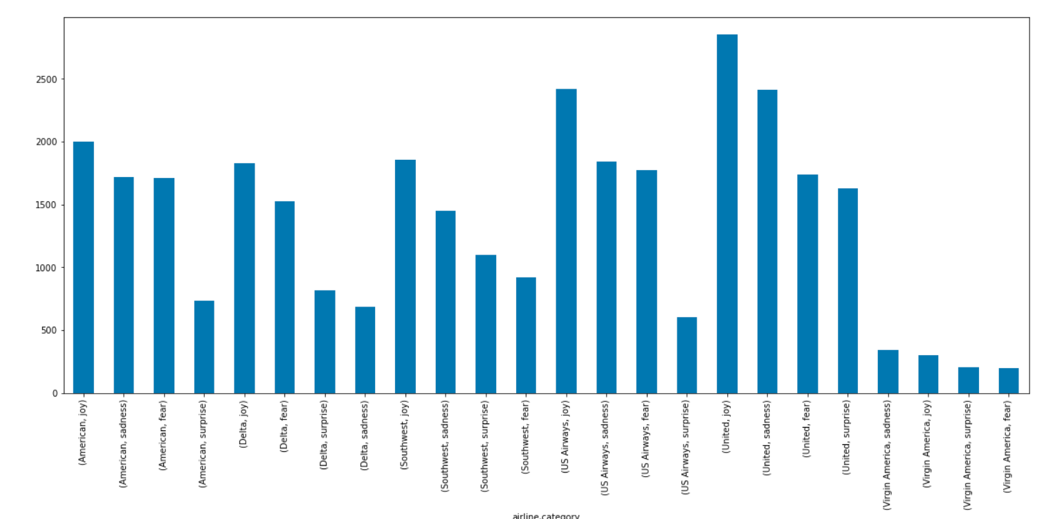
emotion_df = nlp.load('emotion').predict(df)
emotion_df.groupby('airline')['emotion'].value_counts().plot.bar(figsize=(20,8))
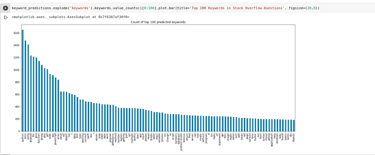
You can visualize a Keyword distribution generated by YAKE like this
keyword_predictions.explode('keywords').keywords.value_counts()[0:100].plot.bar(title='Top 100 Keywords in Stack Overflow Questions', figsize=(20,8))